

Rebrand - Lick Honest Ice Creams
Design Challenge
Choose a well-loved brand ready for a refresh, and reimagine its identity to boost engagement and drive sales. Develop a cohesive visual system—including a new logo, color palette, patterns, and key brand assets—designed for impactful use across digital platforms and advertising channels.
Design Solution
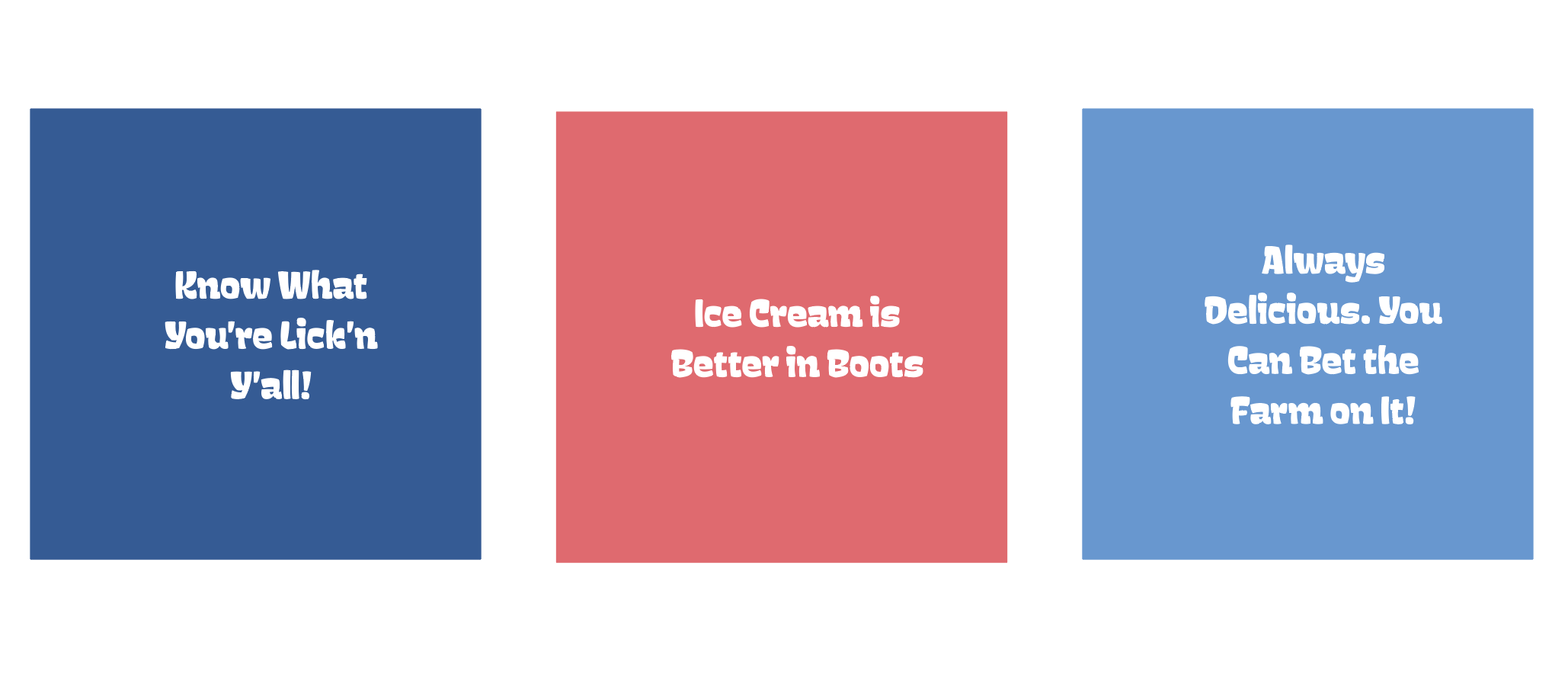
The rebrand of Lick Honest Ice Creams aimed to modernize the beloved Austin-based brand while staying true to its roots. By infusing a fresh dose of Texas flair, introducing a more vibrant color palette, and incorporating playful, handcrafted patterns, the new identity reflects Lick’s bold flavors and honest ingredients. This refreshed look positions the brand for exciting regional and national expansion, all while maintaining the charm and authenticity that made it a local favorite.

Package Redesign - Dark Chocolate Olive Oil & Sea Salt

Cone Sleeves - New Logo and Pattern

New Website Mockup

Rebranded Ice Cream Truck

Social Media - Sample Posts with New Branding

Store Sign

Before - the original Lick brand faced challenges with legibility and lacked distinct brand characteristics

After - the new brand is infused with Texas flare (the letter "L" with a spur), a joyous swirling typeface and optional logomark

New Color Palette
Brand Voice - Sample Language