Website Redesign - Lick Honest Ice Creams
Design Challenge
The Lick Honest Ice Creams website, while reflecting the brand's commitment to artisanal quality and local ingredients, exhibits several design challenges that hinder its effectiveness. The site's visual elements, including its color palette and typography, appear dated and lack cohesion, which can detract from the user experience and fail to convey the brand's vibrant and innovative spirit. Additionally, the navigation structure is somewhat cluttered, making it difficult for users to seamlessly explore the brand's compelling story. These design limitations suggest a need for a refreshed digital presence that aligns more closely with Lick Honest Ice Creams' dynamic identity and enhances user engagement.
Design Solution
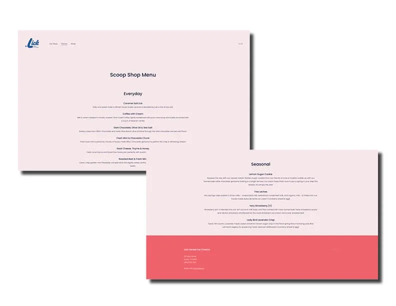
To address the design challenges of Lick Honest Ice Creams' website, we introduced a modern, refreshed landing page featuring a captivating hero image of a consumer holding a delicious ice cream cone — a visual cue that humanizes the brand and immediately draws users in. The entire site now showcases a vibrant new color palette inspired by the cool tones of ice cream with a playful Texas flair, giving the brand a fresh, cohesive look. A redesigned logo, featuring a subtle Texas-inspired spur, reinforces the brand's local roots while adding a unique visual signature. To enhance usability, we streamlined the site’s navigation for easier browsing and elevated key calls-to-action by placing them in distinct, eye-catching boxes, ensuring a smoother and more engaging user experience.
Landing Page - BEFORE Redesign
Landing Page - AFTER Redesign
Home Page - Product Highlight
Home Page - Divider Image and Email Capture
About Page - Founders
About Page - Farmers and Artisans
Flavors Page
Shop Page - Product Selection
Product Details - Very Strawberry
Cart Summary
Checkout


